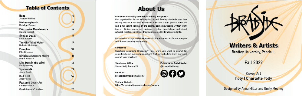
Broadside 2022 Fall Journal
The Broadside Journal is a literary journal made entirely by Bradley University students. For the fall 2022 release, I was a project manager and organized the layout of the twenty page journal on a team of 4.
My Process
As the arts mean a great deal to me, I made sure to represent everyone's work as clearly and as close to the author's vision as possible. While designing, I wanted to make sure literature was readable and that art was given the size it needed to shine. Broadside to me is, in a sense, a conglomerate of all of Bradley's creativity. As such, careful planning and placing was required.
LAYOUTS & DESIGNS IN PROGRESS

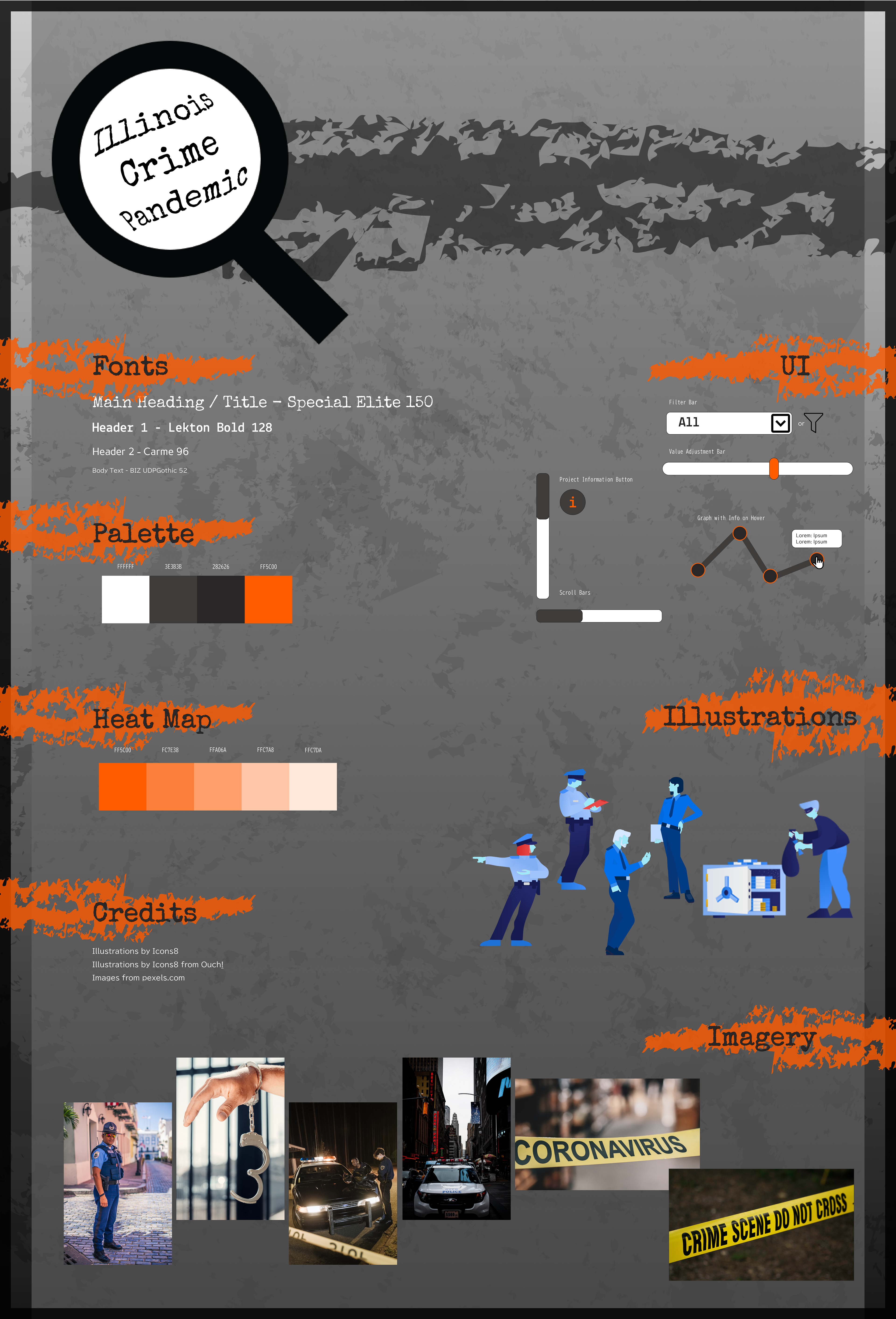
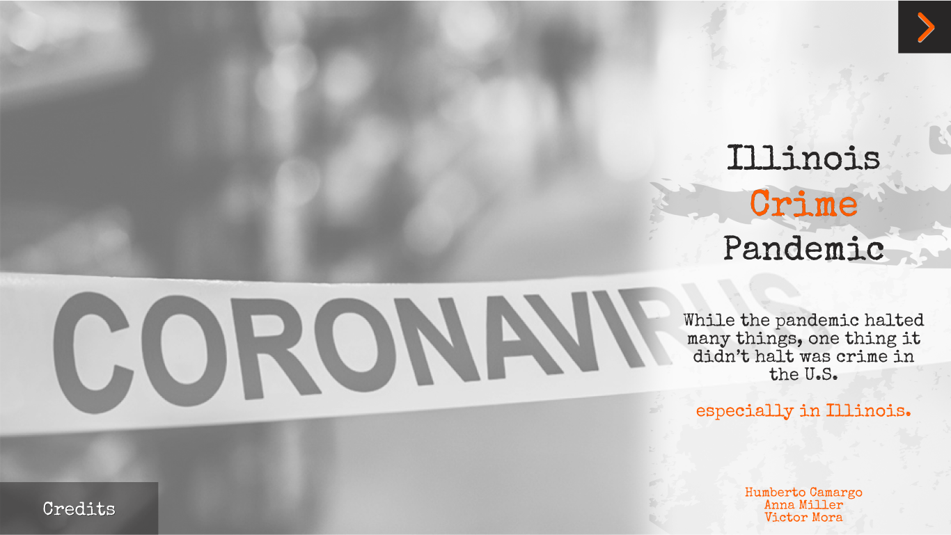
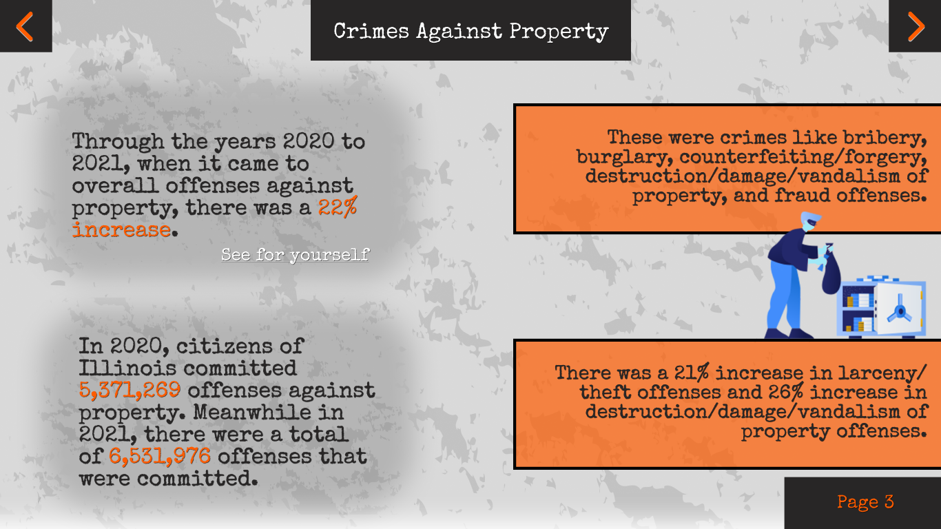
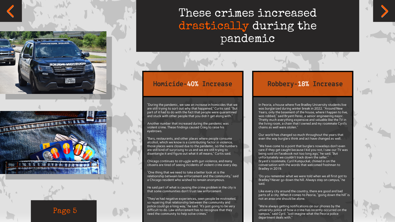
The Illinois Crime Pandemic project is a spread of data created in Tableau representing how crime fluctuated during the COVID-19 pandemic. Accompanying this project was interactive magazine article explaining said data. I was the designer for the interactive article.
My Process
Due to the sensitive nature of this topic, careful design was required in order to keep this project as user friendly as possible. Furthermore, due to the enormous amount of data we received, there was some difficulty making the data spreads digestible yet also interesting. I adopted a gritty color palette that avoids the color red with a more favorable yet still vibrant orange. This project was also very open-ended, so much of my time was spent creating designs for what pages could look like when data was put into them. Thankfully, almost all of those designs ended up being perfect once the story was written.

Broadside 2023 Spring Journal
Just like I did in fall of 2022, I was a project manager for Broadside's 2023 Spring Journal. I had have the same task of organizing layouts. However, Broadside's Spring Journals are over triple the size of the fall ones, so this one clocked in at a whopping 84 pages (or 87 Adobe Illustrator artboards). I was also in charge of designing Broadsheets, which were larger scale posters that combined people's poems and art into one cohesive, wonderful piece.

My Process
Considering the miserable, wet winters my home state of Illinois always suffers, I wanted to encapsulate the full idea of spring in this journal. A good portion of what was written and drawn was either religious focused or animal focused, so I wanted to use the strong pinks, blues, greens, and oranges depicted in the title art to marry spring with these themes. Much of my process also included proper spacing, as the dimensions of both the journal and the broadsheets did not play nicely with people's shapely poems and landscape art. This journal definitely went through many stages of iteration, but it's worth it once you're holding the book in your hands.